How to create B2B ads that actually stop the scroll

I’ve spent my career obsessing over ad creative.
It’s what I did for brands like Kellogg and McDonald’s, and I still do it in B2B, where I try to bring that same B2C energy to creating thumb-stopping, eyebrow-raising ads for SaaS companies. (Because we can’t let B2C have all the fun!)
I recently ran a workshop with Exit Five where I broke down my go-to frameworks for everything from writing better headlines to testing smarter.
Here’s what we covered.
Come for the design, stay for the headline
Did you know that 70% of an ad’s effectiveness comes down to the creative?
As marketers, we spend a lot of time thinking about ad targeting and getting our ads in front of the right people. That’s a big part of the equation, but if the creative isn’t attention-grabbing, the time and money spent on ad targeting will be for nothing.
When working on the creative, remember: people stop scrolling because of design. But the headline is what makes them think, “wow, they really get me.” It’s what convinces them that you understand their problems enough to help solve them.
The meme test: how well do you know your audience?
One simple exercise can help you write more compelling headlines—something I like to call the meme test, which requires you to get to a meme-level understanding of your audience’s problems.
Essentially, could you write an “inside joke” only they would get?
Here are a few warm-up questions that can help you get there:
- What are some trends you see in your customers’/prospects’ behavior? For example, how did they find you? Did they hear about you at a conference? Search in an LLM? Come in through a peer recommendation? Listen to a podcast that mentioned you? And how do they feel about what you’re doing? At Vector, we market to marketers and know that our audience is active on LinkedIn and podcasts. But if your audience is, say, developers, they are notoriously averse to marketing and may find peer recommendations more valuable.
- What are some feelings you hear customers/prospects express in their calls? What emotions keep coming up in these conversations? Are they frustrated, or scared? For example, a lot of marketers are nervous about AI right now and feeling pressure to drive pipeline. Meanwhile, security practitioners are probably worried about catching incidents before they ruin a customer’s day.
- What is the ONE THING your customers/prospects would give their kidney to fix right now? Your customers likely have a whole list of things that cause them stress, but this exercise is about homing in on the one problem that is keeping them up at night and upsetting them more than anything else.
Here are three examples of how I did this for Vector:
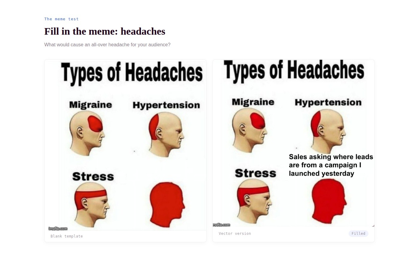
The first meme describes four types of headaches, the last being an all-over headache. To complete this one, I think about what would cause this kind of headache for my audience. For demand gen marketers, this might be “sales asking where leads are from a campaign I launched yesterday.” It’s a great way to understand what frustrates your audience and makes them angry.
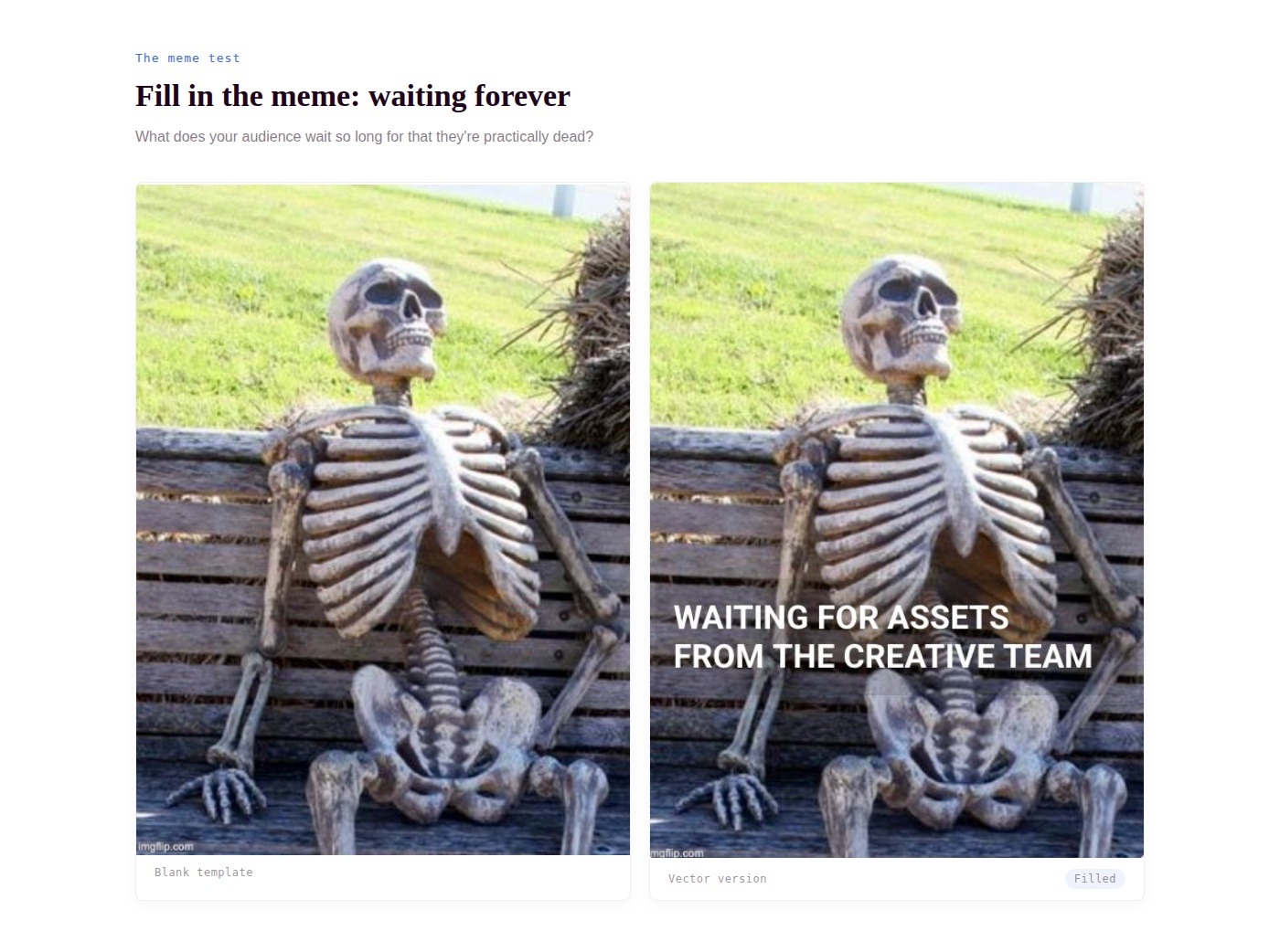
The second meme asks you to consider what your audience waits forever for (until they’re dead ☠️). For example, campaign managers often feel like they’re withering away because they’ve been waiting so long for assets from the creative team.
As you can see, there’s a universality to these blank memes that allows you to fill them in with an idea that really resonates with your audience.
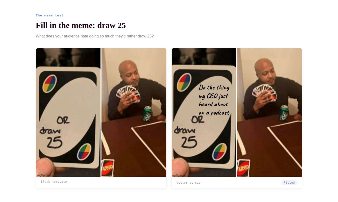
To complete the last meme, ask yourself what your audience hates doing so much that they would rather draw 25 cards in an UNO game. For marketers, that might be “doing the thing my CEO just heard about on a podcast.” (No, Josh, I won’t be putting an elephant in the middle of Times Square.)
Want to try this yourself? Use a meme generator to find blank memes you can experiment with.
Use typography to your advantage
As we’ve covered, a winning ad combines two things: a message that resonates and design that draws people in. And when it comes to design, typography does more heavy lifting than most people realize.
Just take a look at the graphic below. Without even fully reading the text, you’re quickly absorbing a hierarchy of information.
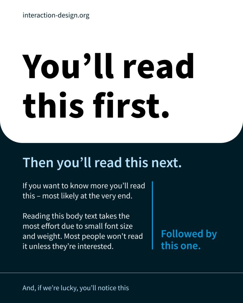
It feels almost like a magic trick, right? Your eye just knows where to go. But it’s not magic—it’s simply typography doing its job. Text weight and density move your buyers to the next point, which is important to keep in mind as you structure your ad.
You should assume that no one will read the entire ad or body copy. If a buyer is high-intent or your ad really spoke to them, maybe they’ll read every word of copy. But never design your ad with that behavior in mind. Instead, bump up your SMIT (your single most important thing) so that it’s the most prominent part of the ad, and make the rest easy to scan.
Two tweaks that double your chances of finding winners
Sometimes the smallest adjustments make the biggest difference. Simple A/B tests are great because they don’t require a lot of work to spin up but can dramatically shift your results and teach you a lot about what your audience responds to.
Here are two tweaks that can improve the effectiveness of your ads:
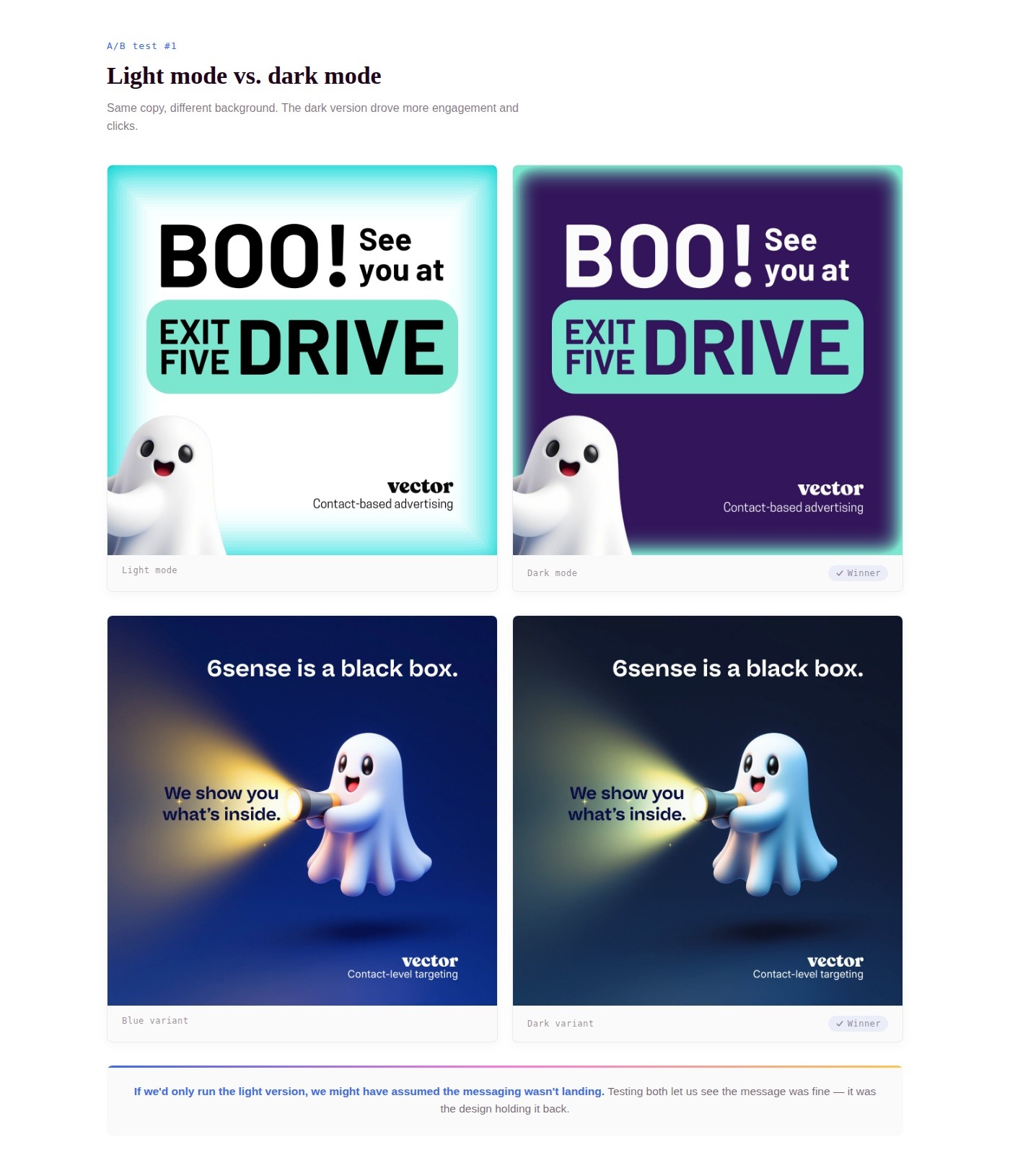
1. Light mode vs. dark mode
Try running your ads in both light and dark mode to see what your audience prefers. Below are a couple of ads we A/B tested, using the same copy but different background and color schemes.
We found that the dark mode version received more engagement and drove more clicks. This is important because if we’d only run the light version, we might have assumed the messaging wasn’t landing. But because we tested both, we could see that the message was fine and it was the design holding it back. That one small insight now informs other campaigns we run.
2. JPG vs. GIF
Adding movement to your ads can have a surprising impact. We ran the ad below as both a still image and a GIF. (The GIF still qualifies as an image, so you can use it for LinkedIn single image ads.) This ad was part of a set that we ran in October, and results were mixed—some versions performed better as a still image while others did better with motion.
Either way, it’s a quick test you can use to boost your creative output without starting from scratch. If you’re already making the still version, you’re halfway there.
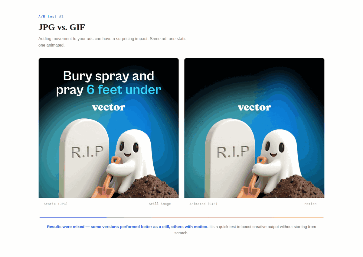
That’s the best part about these tweaks. With the original design completed, you only need a few minutes and a working knowledge of Canva, and you’re all set to ship these simple A/B tests.
Use multivariate testing to get 12 ads out of three ideas
Marketers are always being told to do more with less. The quick tweaks above are a good start. But if you want to kick it up a notch?
Try multivariate testing. Sounds scary, but it’s not.
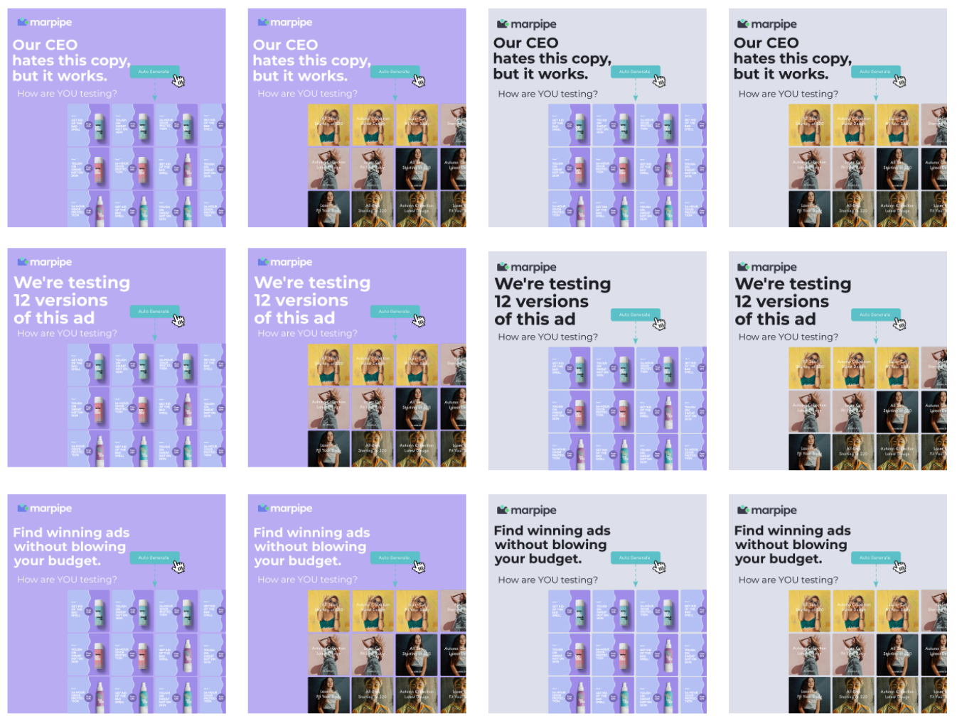
The idea is to take alllll of the assets you’ve whipped up in the process of designing your ad creative, and mix and match them so you have a ton of variations to test. In the example below, we took 2 backgrounds x 2 images x 3 headlines to arrive at 12 different assets we could run all at once with even spend.
Doing that lets you see which variables are the winners. Usually, one background color or image will rise to the top and you’ll get a clearer picture of which headlines are working. Because you’re controlling for all your variables, you’re learning why a specific ad won, which makes the next batch of creative even stronger.
Ready to level up your ads?
Want to see all of this in action? I walked through these frameworks live during a recent Exit Five creative workshop, plus gave real-time feedback on ads from B2B marketers who were brave enough to share their creative.
Watch the full recording here:
Of course, even the best creative falls flat if it’s not reaching the right people. Target lets you build precise, contact-level audiences from a database of 300 million verified contacts and sync them directly to LinkedIn, Google, and Meta, so you can spend less time on list building and more time putting these best practices to work for your ad creative.
And once those ads are live, Reveal shows you exactly who engaged, at the contact level. That means you can see which buyers your creative actually reached and use that to sharpen your next campaign.
Related posts


Ad targeting
doesn't have to be
a guessing game.
Turn your contact-level insights into ready-to-run ad audiences.

Hey, boo — sign up for our newsletter
Frequently asked questions
